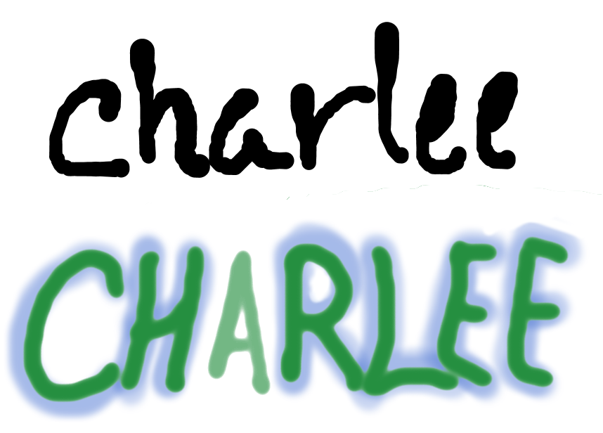
For this assignment, I had to use the cool letters website to get inspiration for writing my name. I instead used my character’s name, since after a while my own name started to look too weird to continue.
The first Charlee represents her collected-yet-still-getting-the-ropes nature. Next is her bolder side, underneath her exterior. The “A” in the second Charlee was a happy accident in the making of the image. Before I did the blue background, I noticed the A was much lighter than the other letters and chose to work it into my drawing. There is no real significance to it, though I do like the accidental effects it gives. The letter looks further away than the others, it is the major component of the stressed syllable in the name, the lightening of the weight of the text overall, etc. The complicated, multi-faceted manner of the ways her name is written attempt to show just how much has yet to be revealed about Charlee Faraday.
2 thoughts on “CHARLEE Lettering”
LOVE this! It’s so creative, and I love how you shared multiple versions! Also, the cover you created for your magazine is so cool! It looks like a cover of Vanity Fair or something like that! So cool! You should seriously be a designer if you are or aren’t already thinking about that! Great job!
Thanks! My career is up in the air right now so that very well might be a possibility haha